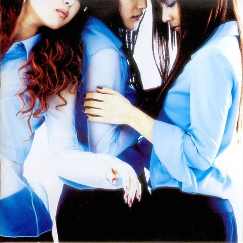
Contradictory the traditional image of fairies and goddesses,
S.E.S' 5th album CHOOSE MY LIFE - U, which has the concept of going out in front of the world as a confident and independent career woman.
At the time, it was the first time that a jacket without a face appeared on the main cover, so fans were super confused.
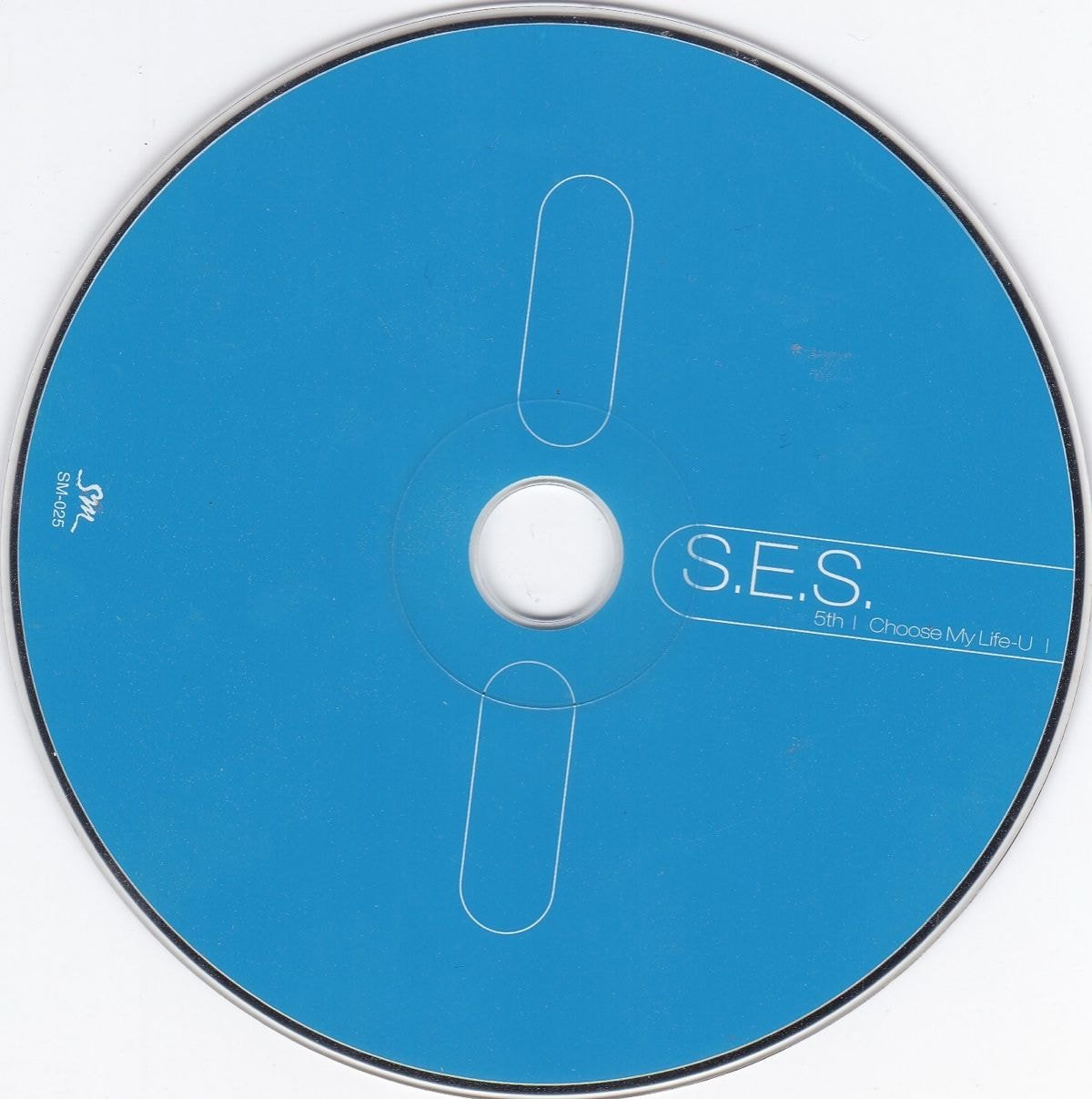 \A CD like this was never seen in 2002 and it looked extremely modern.
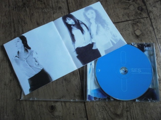
The most unique thing about the album was that although there were individual shots of the members, there were transparent pages printed in between where you could overlap members together.
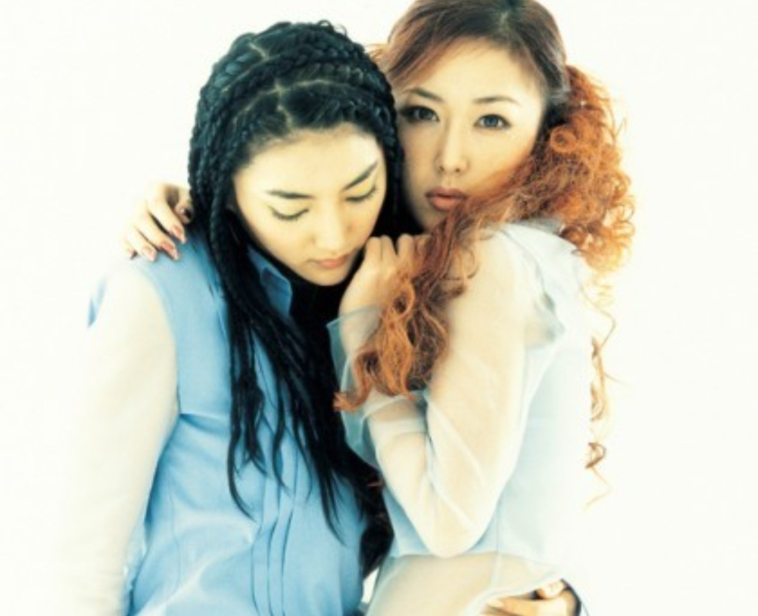
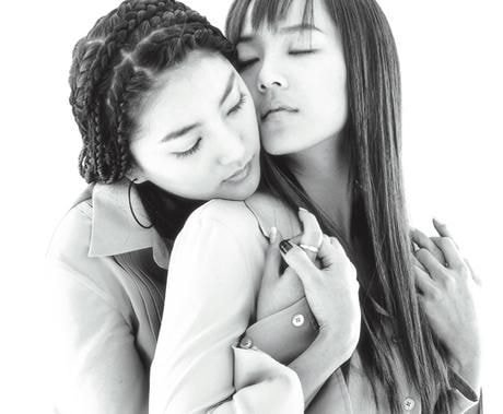
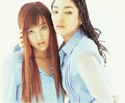


And for the pictures where 2 members are seen together, they really glued them together
Min Heejin and Park Joonyoung were the Art and Design Directors
original post: here
1. Even looking back at these, they still look pretty
2. Her taste is seriously consistent
3. The use of the transparent paper was so good
4. Wow this was so long ago. I could only think of her work in the 2nd and 3rd gen but you're telling me that she was around ever since the 1st gen?
5. Wow but it's impressive how she's now working on NewJeans' concepts 20 years later
6. Even the cuts where they stuck 2 members together shocked the fans so much back then ㅋㅋ
7. Min Heejin joined SM around that time
8. That album honestly felt so artistic at that time. It was so modern
9. Min Heejin was in the design credits for Shinhwa's 5th album released in March of 2002 as wellㅋㅋ she's been earning a title for her name since the start of 2002
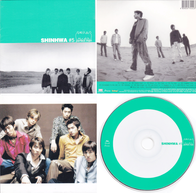
10. Min Heejin's taste is seriouslyㅋㅋㅋㅋㅋㅋㅋ you can really see her own identity


![[instiz] KATSEYE'S NEW SONG IS CRAZY](https://blogger.googleusercontent.com/img/a/AVvXsEg_KzGY6mhW1QUzbuseB-bJwi3qpOoF17ryYpbwAELg18v7Pxev8GxYcvGVuhVUIUQUj7cx5Lk4DtNVYcMv1rr_UeDAAjCetagz2Y_8Oyjm-JBYYuhYRaRnGTkqdzXbNaBXErUxgn9f744Lnob8IlWWUJKCT3Mg9bXmAxd60IYuKUzCd3a8J1kNS6ZTb9Zz=w72-h72-p-k-no-nu)
![[instiz] KATSEYE'S MV AND SONG ARE FREAKING GOOD THOUGH. WHY ARE THE REACTIONS SO BAD??](https://blogger.googleusercontent.com/img/a/AVvXsEiAxeI_XwnX3bgZ6FPpAmodK5VOiuxigfyTyz4cSMKZgBgmTE7gtedowiEGphaGHdhP0eWJGZqhVx3pkbEh0yceNReSa_qVaT6DlxETS5hxKfWtxxGHi9F_gDuDlT1WvP48a68z3-xAOvIehhoOZnNb1KsaH7CVvEeObTeC-W0jSFxh3MhTq3N-0W1t1e97=w72-h72-p-k-no-nu)
![[enter-talk] AESPA NINGNING'S TV APPEARANCE BEFORE DEBUT](https://blogger.googleusercontent.com/img/a/AVvXsEhW1FVpSlWfJHjxkm7roxfFieP8wnAEuOg5PcS6osrjVYk-PZzOOFIhYwypb2MDRlPtINU58T7qvBd0OpRA0VhptaePnuaqSrwj_FghEQPJGKHnbSR2j6BI--hclAIawe0S3RTizVHzezMT1e2pq_J46Rw4t3EULtxMIFkj1qKyjR1VKVOMTHVE7VwrASiq=w72-h72-p-k-no-nu)
![[enter-talk] WHAT'S WITH WINTER'S BARE FACE...?](https://blogger.googleusercontent.com/img/a/AVvXsEjG-plCLAb8PYg8n5pSMAoED0yIi14EXxDt3R3qta6wD8fEViZvSJ2e6In7n8ioaAfGRY7VMt360nLPoscZez0qwdk-GiIXgIT3ujEyW7MRF_5Gqvrk3brt0zXjgVE_-fbwdvK73gDfRFutCww8K-q3SdSJl35w0ImCwxC-RbtY5xvzHr8i8-5uRmu_L6gc=w72-h72-p-k-no-nu)
![[theqoo] LESBIAN DATING SHOW "TO GET HER" RIWON, BJ DAYS DUG UP -> DELETES ALL HER INSTAGRAM POSTS](https://blogger.googleusercontent.com/img/a/AVvXsEhGH7b8KCXzKo5t4pAjtDDcykJEtGLuVCI_NQ1Z1q5LMe3BfX9j4c3ZjLyAgTtHNVd8GgV0qEOba24ihK8VP3pP3P8S3DPtG9-9nmr-Oyeu10rehaVn307sjY6YYtlSWHcNv4puXY9twfrnfCCGr4pS7VpILDoauabjwq92bAi7mWbTm8NAhrCwj7OOBLxS=w72-h72-p-k-no-nu)