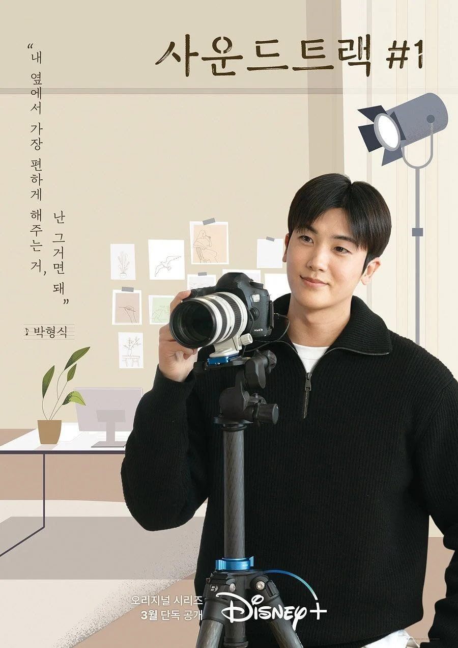
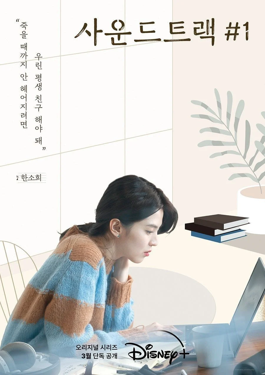
Many say it's like an after-school computer class assignment
original post: here
1. If only they made it a bit more saturated, it would've already been better... The colors look like those default phone filters
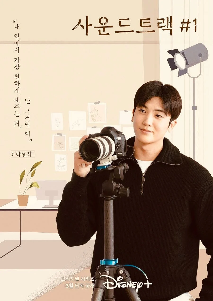
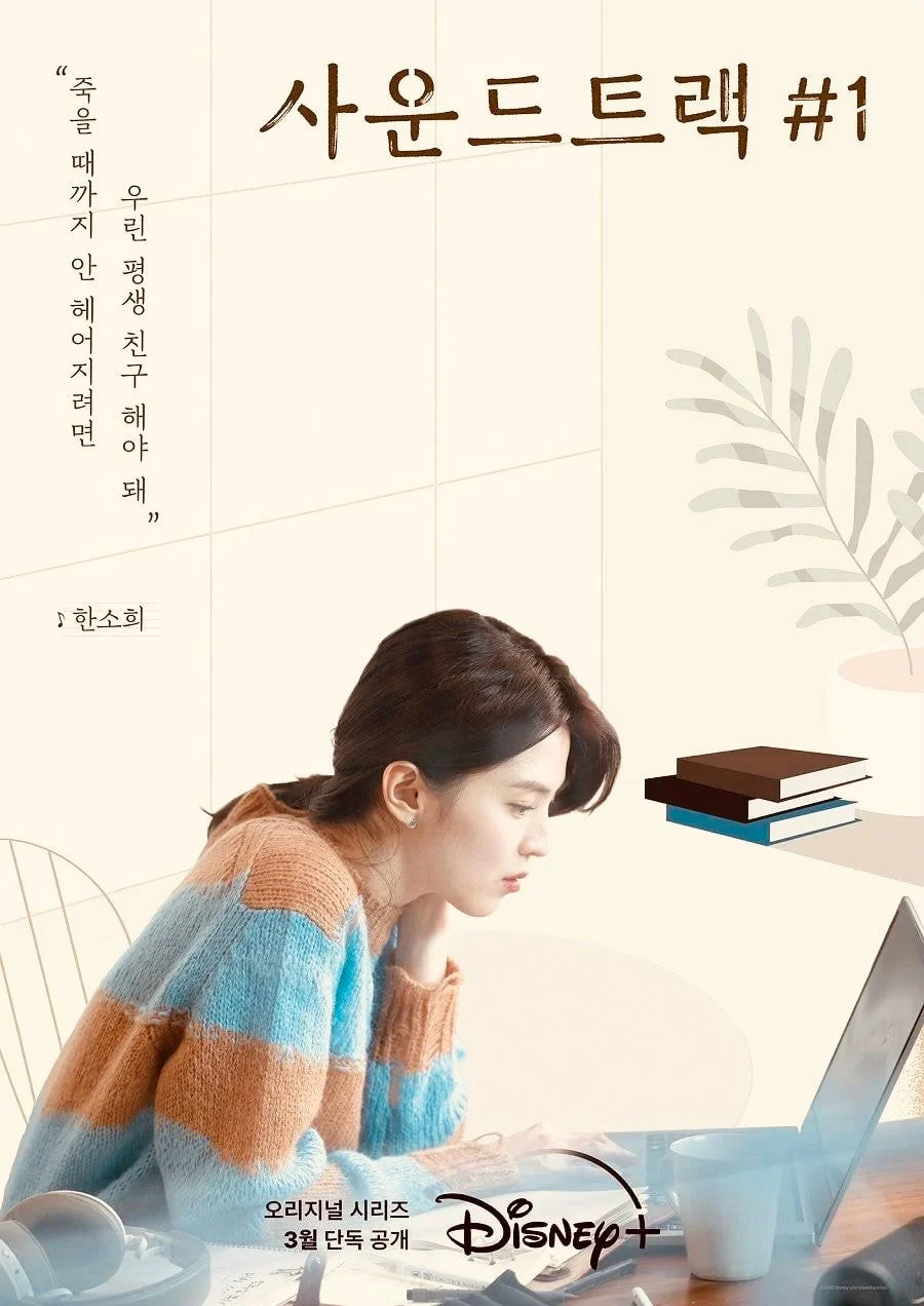
2. It sure looks roughly done
3. As a design fan, the cropping is so poorly done
4. .... Seriously this sucks, Han Sohee's cropping is freaking hilariousㅋㅋㅋㅋㅋㅋ
5. It sure is comparable compared to other Disney+ contents
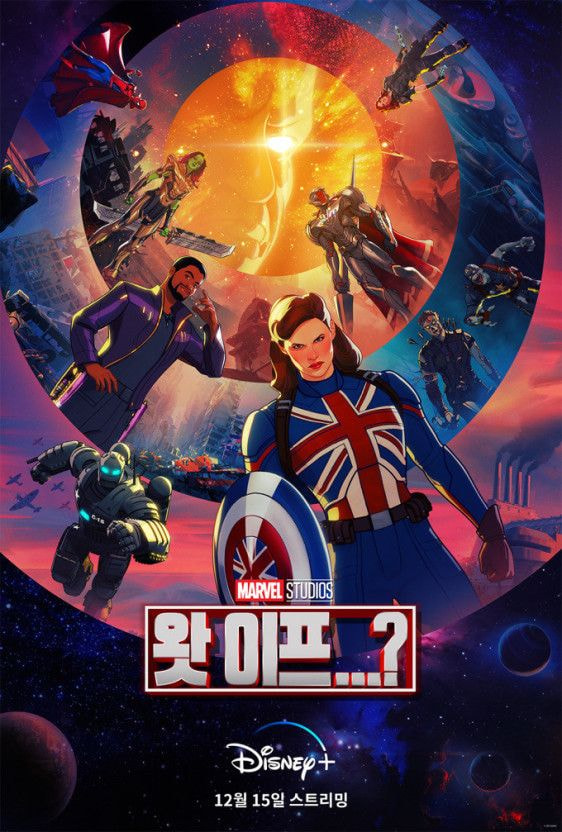
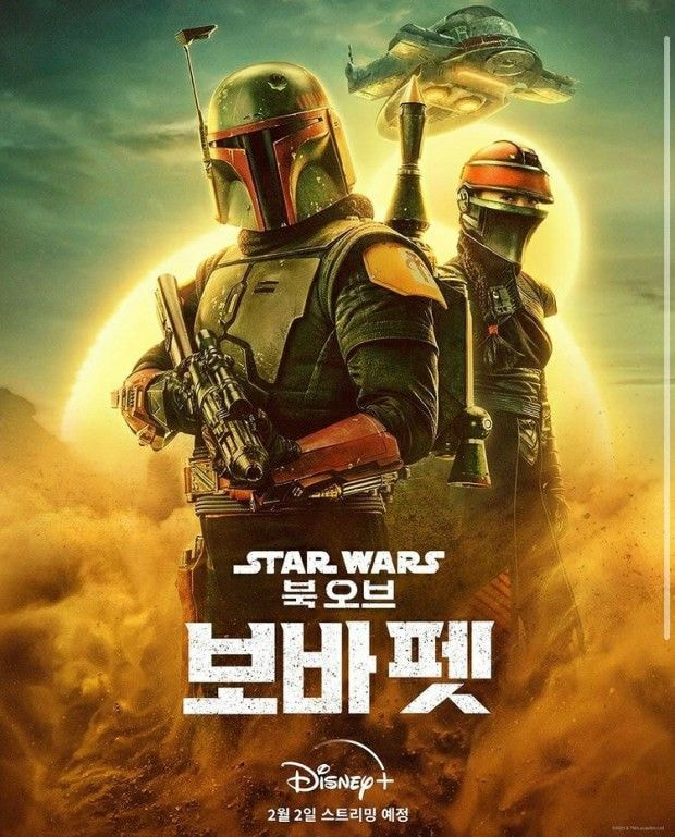
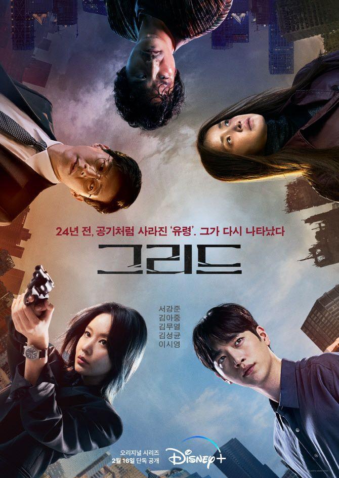
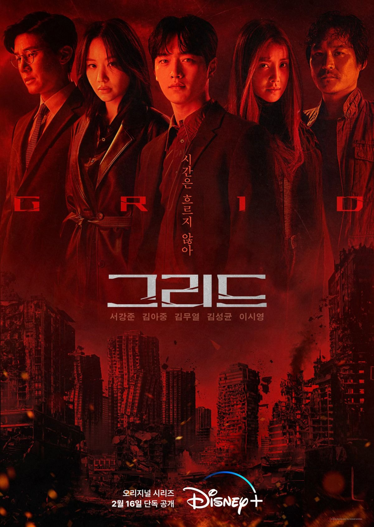
6. I'm a design fan but people really think that this cropping is acceptable? I almost fainted when I saw the hair crop on Han Sohee's hair. From the cropping to everything else, it's a huge mess
7. I'm not a design fan and I'm just a commoner, but I think I can even make something like that...
8. The cropping is actually fine? The cropping isn't the issue, it's the illustration. The colors are so faded and it looks like so many elements are missing... It also feels like the 2 people got different editing
9. If you can't do it right, just give us a photo of their face in big shot
10. They could've just given the fans to edit this....


![[instiz] RM UNFOLLOWED JUNGKOOK](https://blogger.googleusercontent.com/img/a/AVvXsEigm5z4Lbcksjyvlnysup9Kth6BTaIXBD1SJCZ8SIwl1GGYYLlBs74C-BzBgnQsNyrL9C-gDxZbU5C5o5OMsZN_qFNfpSh5PLWasHHKXrIe7_63_YSLmtcC5XvOeYV2n-03Ez7VgR7BDBfzvUMXHMq0q1cPTfSgDPa8KmUVFdNSpAyCK4VEayKNKQyp_SA2=w72-h72-p-k-no-nu)
![[teens stories] HOW YOU CAN TELL A SURGERY NOSE](https://blogger.googleusercontent.com/img/a/AVvXsEg2Sgg_3vg-ktfHhnmlSGXm5i5M1-hCguP7Z7tdSCkVIL_p-QdT1S28467FGvC-4BotPR94qC-ctsndVpQWLsVnokddu4CcmOj1khbXE7PxaZeeNRBpWPc1sN5MGuUZ6YTdjbUAUzCO9OJyYSOj9RJGs7iRIowS1CP16pALVnx868vKErFsEzE5sCnG4fjU=w72-h72-p-k-no-nu)
![[theqoo/instiz] SEVENTEEN VERNON WITH A SHAVED HEAD TODAY...](https://blogger.googleusercontent.com/img/a/AVvXsEgoV3XIp_t7HTEtMuh_6KyeLnKf3QWk2BvnfOulFCJJoyE2DLig5BbtamXcKqzhtdUOg0pecriTcyV0CnKmpVE1lFy4PKoq2F6hUPZQj0ACgZwhUzrZ0VWwm_ieEHuURHLCtPabucvbe9_uXGG4h3GZW1BZ55x8aBNENZ55GVL6TMjuBVp6Uy-iYjmRfxSd=w72-h72-p-k-no-nu)
![[theqoo] KIM MINHEE CAUGHT ON CAMERA 6 MONTHS PREGNANT... HONG SANGSOO, BECOMES A FATHER AT 64](https://blogger.googleusercontent.com/img/a/AVvXsEimig2BPPUtUWLLjvZxIW8DMWM1gSJEu8XSDtAn1GlGKUVMAUrOImGJaS2Jp5Um40fg2ijxOG42y2PoB0MDo_ZIDs4Uq34rslhQ5UneTtp4PtqT3Vpo_0jUBhX1dtj6sCkD5X7e8l6x2kWPyklenzJBAOPG_SfLC1d55Ruz_vOHzBXkXMtGPcLQvttGM-On=w72-h72-p-k-no-nu)
![[teens stories] CELEBRITIES' HOUSES ARE LEGENDARYㅋㅋㅋㅋㅋㅋㅋㅋㅋㅋ](https://blogger.googleusercontent.com/img/a/AVvXsEgR2HLJ9CjWuz6D0E9jdB9DOj58dQGmNz4RVxkNTaIlaFlaBvbI35jhWBwM0j9B3ZApQAVUeUKHyGy-FaYK9G-fqmxPzaAC0PWy_EQwR3sq9GqAHV3xkYCdv65kqjzIjtLkBdXtzzFp-xt0VA2QviT7FFvcR4rVvHw28fTy4eRfcjh3ztkh965yyQDgex8o=w72-h72-p-k-no-nu)
0 Comments